If you're helping run or running an ecommerce store, you've likely heard about the power of Shopify A/B testing. Its a crucial step in ecommerce optimization. An optimized store has a higher probability of converting incoming traffic than a one that’s not.
But did you know that your checkout is one of the most crucial areas to optimize? Improving your checkout experience can significantly boost conversions, reduce checkout abandonment and increase average order value (AOV). The best way to do this is by data driven optimization. In this blog, we’ll dive deep into how A/B testing can transform your ecommerce checkout. So, let’s check it out.
What is A/B Testing?
Let’s start with the basics. A/B testing is a testing methodology comparing versions of a web page, varying on a single element, to see which one performs better. Think of it as a scientific experiment: you take a control version (A), create a variant (B), and then measure which one brings in better results. It's often used to test different elements like buttons, headlines, or layouts, helping you make data-driven decisions to enhance your store’s performance.
Why A/B Testing is key to your Shopify Store’s success?
When it comes to optimizing your Shopify store, A/B testing can be a game-changer. It lets you pinpoint what’s working and what’s not, enabling you to continuously improve your site based on real data—not just guesswork. Here are a few key reasons why A/B testing is so important:
Reduce Bounce Rates
A high bounce rate means visitors aren't finding what they expect or are disengaged. Use Shopify A/B testing to tweak layouts, content, and CTAs to discover what resonates with users, leading to lower bounce rates, longer site visits, and higher sales.
Boost Conversion Rates
Optimize product pages, CTA buttons, and checkout upsell blocks through Shopify A/B testing to improve conversion rates on a page and element level, driving overall sitewide improvements.
Minimize Cart Abandonment
Test different checkout flows and payment options to identify and remove friction points that cause cart abandonment, with global cart abandonment rates hovering around 70%.
Reduce Checkout Abandonment
Checkout optimization is key to completing the purchase journey. Focus on this "last mile" to push customers over the finish line.
Enhance User Experience
Shopify A/B testing refines the shopping experience by applying UX best practices. An intuitive site leads to longer visits, higher conversions, brand loyalty, and positive referrals.
Key Areas to Run A/B Tests in a Shopify Store
Before we dive into checkout-specific testing, let’s briefly cover the broader areas in your store where Shopify A/B testing can make an impact.
- Home Pages and Landing Pages: Experiment with different headlines, hero images, and promotional offers.
- Product Pages: Test product descriptions, pricing displays, image layouts, and CTA buttons.
- Checkout Pages: Optimize form fields, payment methods, and shipping options (more on this later).
- Cart Pages: Test free shipping thresholds, cross-sell products, and urgency triggers.
Now that we’ve got the basics covered, let’s zoom in on the checkout process itself.
Why A/B Testing Your Checkout is Important
Now, let’s focus solely on the area that truly makes or breaks a sale; your checkout page. Here’s where A/B testing comes into play.
Reduce Checkout Abandonment- Checkout is the final conversion step; A/B testing removes friction points such as confusing layout and excess form fields can help reduce checkout abandonment. Stores even test the placement of your payment methods and address fields.
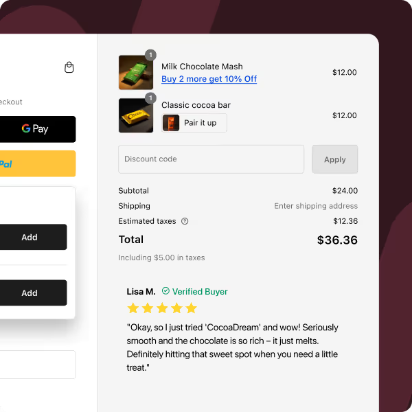
Increasing AOV- Checkout is a highly effective piece of real estate when it comes to increasing you AOV. Hence many brands create upsell/cross-sell recommendations in their checkout. A/B testing helps them choose widgets that work the best. If you want to know more about leveraging upsells and cross-sells at checkout, read our blog here.
Enhances User Trust- A/B testing your trust badges, reviews and ratings, helps you pick the most effective way to place these in your checkout.
We will explore and many other points in-depth, in the following sections.
PRO-TIP: Use Checkout Wiz for checkout A/B testing. It is the only A-Z Shopify checkout app that you’ll need to create impactful checkouts that convert. Checkout Wiz empowers you to A/B test each and every checkout element and make data-driven decisions.
How to Run an A/B Test on Shopify Checkouts
Running Shopify A/B test on your Shopify checkout process might sound complex, but it’s actually quite manageable—and the payoff can be huge. Here’s a step-by-step guide on how to run an A/B test for your Shopify checkout:
1. Choose an A/B Testing Tool that’s Checkout Specific
First, you’ll need an A/B testing tool that is with Shopify Plus, especially the checkout. Checkout Wiz is the most powerful checkout creation app in the market currently and it lets you A/B test elements in your checkout effortlessly. There are other tools too, which you can explore. Make sure whatever you choose, it is compatible with Shopify and allows you to track key metrics like conversions, clicks, and user engagement.
2. Define Your Goal and Hypothesis
Before you start, it’s important to define exactly what you want to achieve and what element you’re testing. Here’s an example:
Goal: Increase checkout completion rate by 5%.
Hypothesis: Reducing the number of form fields will make the checkout process easier, increasing completion rates.
Be clear about your goal—whether it’s lowering cart abandonment, increasing your AOV, improving upsell views, or improving overall conversions.
3. Choose a Single Variable to Test
A key rule in A/B testing is to focus on one element at a time. This helps you pinpoint exactly what caused any changes in performance. Here are some examples of what you could test on your Shopify checkout:
Layout: Single-page checkout vs. multi-step checkout.
Button Copy: Test the CTA for example, “checkout now” versus “pay now”.
Payment Methods: Offering PayPal as the first option vs. offering credit cards first.
Trust Signals: Adding trust badges or security logos on the left side top or right side bottom.
It’s tempting to jump into testing many variables together, but doing so can lead to confusing results. Stick to one change at a time for clear, actionable insights.
4. Create Your Variants
Now it’s time to create your A/B test variants. Your control is the original version of your checkout (let’s call it Version A), and your variant (Version B) includes the change you want to test.
For example, if you’re testing form field length, your control might be a checkout form with 8 required fields, while your variant could reduce this to 5 required fields.
5. Calculate Your Sample Size and A/B Testing Duration
To get accurate results, you’ll need to run your test with enough traffic to gather statistically significant data. Most A/B testing tools will help you calculate the necessary sample size based on your current traffic. In general:
- Higher traffic means you’ll get your A/B test results faster.
- Stores with lower traffic will need to run tests for longer to gather sufficient data. Such tests can run for a few weeks.
Avoid stopping your test too early. Let it run for enough time to ensure your results are statistically significant.
6. Run Your A/B Test
Once your test is set up, it’s time to let it run! Your testing tool will randomly split traffic between your control (Version A) and your variant (Version B). As users interact with each version of the checkout page, the tool tracks important metrics like conversion rates, average order value, clicks etc.
7. Analyze the Results
After the test has run for the set time, it’s time to review the results. Your A/B testing tool will provide a clear comparison between the control and variant. Focus on key metrics such as conversion rate, bounce rate, aov and checkout abandonment rate. If your variant outperforms your control in a statistically significant way, you’ve got your winner.
8. Execute the Winning Variant
If your A/B test shows that the variant improved performance (higher conversions, fewer abandoned carts, etc.), you can confidently implement it as the new default for your checkout page.
However, A/B testing is an ongoing process. You have to test, iterate and test again. Ecommerce trends and user behaviors change, so it’s important to continue testing new elements that you add to your store. Sometimes you may want to remove an element that is causing a hindrance. Key is to never stop testing.
Checkout Page Elements You Should A/B Test
Checkouts especially single page ones can be deceiving due their apparent simplicity. However, when you take a close microscopic look, you will see hundreds of elements you can and should test. Let’s explore these as per their type.
1. Layout and Structure
Should you use a single-page checkout or a multi-step checkout? A/B testing can help you find out which structure works better for your audience. Some users prefer to see everything in one place, while others may find multi-step checkouts less overwhelming.
2. Shipping Information & Options
Test how shipping details displayed correlate to conversions. For example, what if you present delivery estimates upfront? You can also test how providing many versus few shipping options impact conversions.
3. Shipping Upsells
A/B testing shipping upsells can impact your conversion rates and ofcourse AOV. Priority shipping is an example of a shipping upsell. Make sure to A/B test different headlines and copies for this widget.
4. Free Shipping
Your free shipping offer becomes crucial at checkout. Customers usually pay heed to other discounts when browsing the store. It’s only when they reach cart/checkout (having made their decision), are they in the mind space to consider other product to reach the free shipping threshold.
- Test whether offering free shipping at a certain order value lead to higher conversions
- Test a free shipping progress bar- does visual representation help increase free shipping based revenue?
- Test headline and copy for free shipping progress bar widget
5. Insurance & Packaging Upsells
Insurance & packaging are effective ways to increase AOV at checkout. In fact we have clients that made upwwards of $40,000 just through these upsells. Use A/B test to decide on a copy that drives maximum conversions. Also, layout matters. Think through the design of your upsell block. Checkbox? Drop down? Test these too.
6. Checkout Upsells & Cross-sells
Upsells at checkouts are the most crucial AOV bumping tools. Its essentially making another sale. Here’s what you could check when A/B testing:
- Upsell block layouts- drop downs, vertical or horizontal, quantity modifiers
- Headline & copy-choose ones with better conversion rates
- Product images- test which images work best in the small space that upsell blocks afford
7. Trust Signals and Security Features
Adding trust badges and security logos (like SSL certificates and accepted payment methods) can reassure customers during the checkout process. They help reinforce trust in your product, brand and your store overall. But where should you place them? A/B test different placements, such as near the payment section or in the footer and observe how they influence customer trust and conversions.
8. Button Copy and Calls to Action
Your CTA buttons on the checkout page such as “pay now” or “complete purchase” are incredibly important. Testing different copy, sizes, and colors can have a surprising effect on how many people complete the checkout process. For example, does “pay now” perform better than “checkout”? Test and find out.
9. Guest Checkout vs. Account Creation
Some customers prefer to checkout as a guest without the hassle of creating an account. A/B test how offering guest checkout impacts conversion rates compared to forcing account creation. You could also test offering incentives for account creation, such as discounts or faster future checkouts.
10. Progress Indicators
A/B testing progress bars or step indicators can reduce friction by helping users see how many steps are left in the checkout process. Whether it's a percentage complete or a visual indicator, these elements give users a sense of control and transparency.
11. Form Field Length
Ever been put off by a checkout form asking for too much information? A/B test the number of form fields and see whether reducing them improves completion rates.
12. Form Field Optimizations
You can also test options like auto-fill features, inline validation (which shows errors as users type), and which fields should be mandatory versus optional. Again, these impact your completion rates.
13. Number of Payment Methods
Offering the right payment options is critical. If you are considering offering a new payment method, it is best to A/B test to measure incremental improvements if any. For example, if you are introducing Buy Now, Pay Later (BNPL) options, you will want to know if it made a difference to your conversion rates.
14. Order of Payment Methods
A/B test whether placing certain payment methods such as PayPal or Apple Pay or Shop Pay, ahead of others increases conversions. It depends on the way that customers naturally scan the page.If some favourable methods are showcased upfront, they are more likely to convert.
15. Post-Purchase Upsells and Cross-Sells
The sale doesn’t have to end at checkout. Testing post-purchase upsell offers or product recommendations on the confirmation page can increase revenue. A/B test personalized recommendations and discounts types. You can also A/B test time-bound offers versus offers with no time limit.
16. Post-Purchase Surveys and Feedback
Here’s the goal is to get maximum number of customers to respond to your survey. Test what copy works to encourage them to participate. You can also experiment with pop-ups. Length of your survey matters. Test different lengths, layouts and fields.
Conclusion: Start Testing, Start Winning
Running an A/B test on your Shopify checkout is one of the most impactful things you can do to improve your store’s conversion rate. By focusing on data-driven decisions and consistently testing key checkout elements, you can create a more efficient, user-friendly, and high-converting checkout experience. Be patient, proceed step-by-step and make sure you test all your elements at checkout. In time, you will surely see a lift in your AOV, conversions and loyalty. Happy testing!

.svg)
.svg)
.svg)
.svg)
.svg)
.svg)
.svg)
.svg)


.svg)
.svg)

.svg)
.svg)


.svg)
.avif)


.jpg)


.svg)


.svg)


