Your Shopify checkout flow can play a crucial role in your ecommerce conversions. A well-structured checkout flow not only simplifies the purchase journey but also significantly reduces cart abandonment rates. However you must be all too familiar with Shopify obsession with prioritising single click checkouts. That's where the Shopify single page checkout comes into play.
But does that work better than the other?
In this post, we delve into the two predominant strategies, one-page vs. multi-page checkout, to understand which is more effective in optimizing conversions.
What is a Shopify One-Page Checkout?
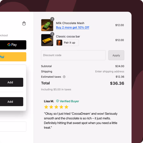
Also known as the Shopify single page checkout, the one-page checkout model simplifies the purchasing journey by consolidating all steps into a single, streamlined page. This approach is designed to make the checkout process more efficient and user-friendly.
Let's look at the advantages and disadvantages of implementing a one-page checkout in ecommerce:
Pros of Shopify One-Page Checkout
1. Reduced Checkout Time
The Shopify one-page checkout significantly accelerates the purchase process. Compared to the average 1:40 minutes required for a multi-page checkout, a one-page system can trim this down to just 53 seconds.
This reduction in time not only enhances the user experience but also plays a crucial role in improving conversion rates, as customers appreciate and respond positively to a quicker checkout experience.
By condensing the checkout process into a single page, the number of clicks and interactions required from the customer is significantly reduced. This streamlined approach not only makes the process faster but also more convenient, as customers can enter all their details in one go without having to navigate through multiple pages.
The reduction in clicks also means there's less chance for customers to second-guess their purchase, leading to a smoother transaction.
3. Highly Intuitive Design
Presenting all the necessary checkout steps on 1-page makes the process inherently intuitive. Customers can see the entirety of their checkout journey at a glance, which helps understand how far they have progressed and what's left to do. This clarity in navigation can greatly reduce confusion and hesitation, contributing to a more positive user experience and potentially higher conversion rates.
I should highlight that if you have a Shopify Plus single page checkout, you can do a lot more in terms of using banners, opt-ins, button designs. These are easily editable Shopify one page checkout apps such a Checkout Wiz that supports Shopify Checkout Extensibility.
4. Minimizes Cart Abandonment
One of the key advantages of a Shopify one-page checkout is its ability to reduce cart abandonment rates. With every step and requirement clearly visible on a single page, customers are less likely to get frustrated or overwhelmed, which are common reasons for abandoning carts. The simplicity and transparency of seeing everything at once reassure customers, encouraging them to complete their purchase. That is why Shopify one-page checkout conversion rate is often higher than a multi-page checkout.
One of the main drawbacks of a Shopify one-page checkout is the potential to overwhelm customers with too much information at once. When a checkout page is densely packed with numerous fields and options, it can lead to confusion and frustration, particularly for customers who prefer a more guided and segmented approach. This overwhelming experience can be counterintuitive to the checkout's primary goal of simplifying the process.
Therefore, it's essential to carefully design Shopify one-page checkouts to ensure they are intuitive and user-friendly without bombarding customers with an overload of information that could deter them from completing their purchases.
2. Limited Analytical Insights
A Shopify one-page checkout can pose challenges for in-depth analytics, especially for businesses that rely on tools like Google Analytics to track customer behavior through the checkout process. In a multi-page setup, it’s easier to identify at which specific step customers drop off, allowing for targeted improvements.
However, with a one-page checkout, this granularity in data is lost. As all actions take place on a single page, it becomes more challenging to pinpoint where customers decide to abandon their carts and why. This lack of detailed analytical data can hinder the optimization process and make it more difficult to refine the checkout experience based on customer behavior.
Now since the main goal of this blog is considering a multi-step vs one-step checkout, let's get to it.
What is Shopify's Multi-Step Checkout?
A multi-page or multi-step checkout divides the checkout process into distinct steps and pages, guiding customers through a series of actions to complete their purchase.
Pros of Shopify Multi-Page Checkout
1. Enhanced Customer Control
The multi-page checkout design offers customers a greater degree of control over their purchasing process. By breaking down the checkout into distinct stages, it allows customers to focus on one set of details at a time.
This step-by-step approach not only minimizes the risk of input errors but also gives customers the opportunity to review and confirm information at each stage. As a result, customers feel more in control and assured that their order details are accurate, leading to a more satisfying purchase experience.
2. Improved Analytical Insights
Multi-page checkouts offer a distinct advantage when it comes to analytics and performance tracking. Tools like Google Analytics can be used more effectively in this setup to monitor customer behavior across different stages of the checkout process.
This detailed analysis makes it easier for businesses to pinpoint exactly where customers are dropping off. Knowing which specific page or step has a higher abandonment rate allows for more targeted and efficient optimizations, potentially increasing overall conversion rates.
3. Opportunities to Re-engage Customers
One strategic benefit of a multi-step checkout is the early collection of customer contact information, usually in the initial steps. If a customer starts the checkout process but doesn't complete their purchase, the gathered information (such as email addresses) can be utilized to re-engage them.
Follow-up emails can be sent to these customers, reminding them of their incomplete purchase or offering assistance, thus providing a chance to recover potentially lost sales. This proactive approach to re-engagement can be a key factor in boosting conversions and enhancing customer relations.
Cons of Shopify Multi-Page Checkout
1. Time-Consuming Nature
A significant downside of multi-page checkouts is the extended time it takes to complete a transaction. Each additional page or step in the process adds to the overall duration, which can test the patience of customers.
In today's fast-paced digital environment, where speed is often equated with efficiency, the prolonged nature of multi-step checkouts can lead to higher instances of cart abandonment. Customers, particularly those accustomed to quick online transactions, might find the extended process tedious and may lose interest midway, moving on to other tasks or websites.
2. User Experience (UX) Challenges
From a user experience standpoint, multi-page checkouts present several potential hurdles. Customers often have to navigate through multiple pages to enter or modify information, which can be especially cumbersome if they need to make changes to previously entered details, like adjusting their shipping address or adding special instructions.
This back-and-forth navigation can not only be time-consuming but also frustrating, diminishing the overall quality of the user experience. Such UX challenges can be particularly off-putting for new or less tech-savvy customers, who might find the process confusing and, consequently, are more likely to abandon their carts.
Shopify One Page Checkout vs. 3-page Checkout: Comparison
Deciding Between One-Page and Multi-Page Checkouts for Your Ecommerce Store
Choosing the right checkout style is crucial for optimizing your eCommerce store's conversion rates. Here's a breakdown to help you decide:
Shopify One-Page Checkout
Ideal for Digital and Downloadable Products: For quick purchases like digital items, Shopify one-page checkout streamlines the process by consolidating address and shipping details on a single page.
Effective for Frequent Shoppers: Businesses with a high rate of returning customers or registered users who make regular purchases can benefit significantly from the convenience of a one-page checkout.
Best Suited for Low-Cost Items: The simplicity and speed of a Shopify one-page checkouts make them particularly effective for lower-cost products, where the decision-making process is typically quicker.
Optimal for High-Value Purchases: For items with a higher price tag or those requiring more thoughtful consideration, a multi-page checkout process can provide customers with the reassurance they need, breaking down the purchase into digestible steps.
Boosts Customer Confidence: Allowing customers to review details like their order, delivery address, and pricing at each step enhances their confidence in the purchase, reducing the likelihood of cart abandonment.
Crucial for Information Review: Implementing a design where customers can easily review and edit their information before proceeding ensures a smooth and reliable checkout experience.
Whether opting for a one-page checkout on Shopify or a multi-step checkout approach, the key objective remains the same: to facilitate a checkout experience that is both smooth and efficient, ultimately driving higher conversion rates.
For brands seeking an optimized checkout solution specifically tailored to Shopify stores, exploring Checkout Wiz by Skailama could be a game-changer. The app is designed to help you customize your checkout page for maximum conversions.
But that’s not all, our checkout optimization also opens up new opportunities to help you sell more to an engaged visitor, thereby increasing your average order value and business revenue! You can do this via high converting checkout upsells to earn significant checkout revenue. All the best.
To optimize your Shopify checkout to it's full extent, you need to migrate your Shopify Checkout from Checkout.liquid to Checkout.extensions. Here's a easy 6 step process for you to migrate your Checkout right away:
Hurrify customers to buy within a given timeframe with a sales countdown timer & improve conversions
Another popular Shopify checkout app is Checkout Promotions. The app comes with the ability to leverage a collection of highly robust visibility rules that help show customers one-click post purchase upsell promotions after an order payment has been made. Some of its key features include:
Features
AI recommended and manual recommendations for upselling.
Complete branding control.
Checkout Upsell for increasing AOV.
AI recommended and manual recommendations for upselling.
Pricing
Development
Free
Monthly Plan
$99/ month
Plus Plan
$99/ month
Plus Plan
$99/ month
FAQs on Shopify One-Page Checkout v.s Multi-Page Checkout
What is one-page checkout?
What are the advantages of one-page checkout?
Does Shopify have one-click checkout?
How do I turn on one-page checkout on Shopify?
What is the conversion rate of Shopify one-page checkout?
×
Surya V
Surya leads Product Management at Skai Lama. He talks about Shopify Checkout, Conversion Optimization, and growth tactics for Shopify Plus stores.

.svg)
.svg)
.svg)
.svg)


.svg)
.avif)


.svg)


.svg)


.svg)


.svg)